How to Present a Long Website Mockup Without Overwhelming the Client
A practical presentation method for long landing pages and full website screenshots that need more context than a single attachment.
Read article ↗Practical guidance for presenting website designs and making feedback easier to use.
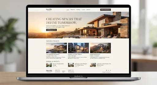
A practical presentation method for long landing pages and full website screenshots that need more context than a single attachment.
Read article ↗A practical responsibility model for client design reviews, including who comments, who resolves conflicts and who confirms the next step.
Read article ↗A focused template for the information that should accompany an approved website mockup before implementation begins.
Read article ↗A design-review framework for multilingual pages that checks real translated content rather than assuming every language fits the original layout.
Read article ↗Make image decisions that support the page message instead of treating photography as a final decorative layer.
Read article ↗A client-friendly framework for assessing type across headings, body copy, cards and mobile layouts before final design approval.
Read article ↗Look beyond the empty form and review the full enquiry experience, including incomplete entries and the message after submission.
Read article ↗A practical way to review menus with clients using realistic visitor tasks instead of arguing about link order in isolation.
Read article ↗Evaluate the first screen as a coherent introduction rather than a large heading, attractive picture and disconnected button.
Read article ↗Bring the design. Keep the conversation attached to it.
Upload a Mockup ↗